An enhanced text-field% GUI control for Racket
The Racket GUI library provides a text-field% control which allows input of arbitrary text, but only basic functionality by default. However, the class is designed to be extensible and in this article we’ll look at how to extend this control to provide a more modern input control with a cue text and input data validation.
Update 05/03/2019: This code is now available as a Racket Package which can be installed using raco pkg install gui-widget-mixins. You can read the documentation for this package here or visit the GitHub repository.
An initial, basic example
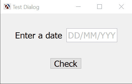
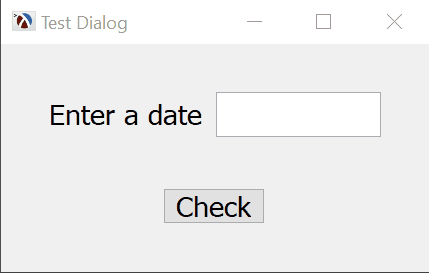
For the purposes of this example, we’ll use a simple application which asks the user to enter a valid date, in the format “DD/MM/YYYY”, and checks if this date is valid. This is the type of user interface that most people would come up with if they consulted the Racket GUI reference documentation.

The program is simple enough that it can be written with just a few lines of code:
1 2 3 4 5 6 7 8 9 10 11 12 13 14 15 |
(define toplevel (new frame% [label "Test Dialog"])) (define input (new text-field% [label "Enter a date "] [parent toplevel])) (define (button-callback b e) (let ((text (send input get-value))) (if (string->date text) (message-box "OK" (format "Date is valid: ~a" text) toplevel '(no-icon ok)) (message-box "Error" "Invalid Date, expecting DD/MM/YYYY" toplevel '(stop ok))))) (new button% [label "Check"] [parent toplevel] [font font] [callback button-callback]) (send toplevel show #t) |
The program creates a frame% object, named toplevel which is the toplevel window, than adds two controls: a text-field% named input and a button named check. The callback, which is invoked when the button is pressed, will retrieve the contents of the input field, check if it is a valid date and display a message informing the user if the date is valid or not.
To make the application complete, we need to implement our own string->date function which converts the string from the text input into a date, or returns #f if the string is not a valid date. This function will be used to validate the user input:
1 2 3 4 5 6 7 8 9 10 11 |
(require racket/date) (define (string->date str) (let* ([t (string-trim str)] [m (regexp-match "^([0-9]+)/([0-9]+)/([0-9]+)$" t)]) (and m (let ((day (string->number (list-ref m 1))) (month (string->number (list-ref m 2))) (year (string->number (list-ref m 3)))) (with-handlers (((lambda (e) #t) (lambda (e) #f))) (find-seconds 0 0 0 day month year)))))) |
This program is not user friendly: while the input field accepts any text, the program will reject some inputs and only inform the user about the bad contents after a button is pressed. Plus, there is no hint in the dialog what the valid data format is, and adding this information to the form will just take up more space — this is not a big problem in a form with one input field, but most GUI forms have several inputs on them and there might not be enough room for such info to be displayed. We will look on how to address some of these usability problems in the sections below.
Displaying a cue text when the input field is empty
As space on a GUI form is at a premium, it makes sense to provide some additional hints inside the input field itself when the field is empty. In the previous example program, the user is asked to enter a date, however it is not clear what date format to use, it could be “DD/MM/YYYY”, “MM/DD/YYYY” or any one of the many other formats; we can improve the user experience by displaying the cue text “DD/MM/YYYY” when the field is empty, to indicate the format the date is expected.
To distinguish the cue text from the normal input field contents, the cue text will be displayed using a different color. The underlying text% object used by the text-field% field already supports text coloring by using style-delta% objects — these objects encapsulate a “change” to the way a piece of text is rendered, and they are simpler to use than specifying every aspect of the rendering (font, size, alignment, etc). We will define two style delta objects that change the color of the text in the input field: a gray one for the cue text and a black one for the actual input contents:
For the cue text itself, we need to extend the text-field% to add a mechanism that inserts the cue text when the field is empty and removes it just before the user starts to type some text into the field. The entire class definition is shown below, and while it is somewhat long, it is relatively easy to understand. First, the underlying foundation parts:
- the class adds a
cueinit field, which will allow the user to specify what the cue text will be. - the
callbackinit field is also intercepted, this is used by thetext-field%to inform the user that the contents of the field have changed — we will override this callback to prevent the user from receiving notifications about the cue text. - a
showing-cue?member variable is added, which will keep track of whether the cue or the user input is shown in the field. - for convenience, the
editorvariable holds a reference to thetext-fieldinternaltext%field. - the
maybe-insert-cueandclear-cuefunctions are responsible for inserting the cue text or clearing it, and also changing the color of the text for the cue.
To actually insert and remove the cue text at the right moments, we need to intercept a few methods and initialization steps:
The on-subwindow-char is overridden to remove the cue text and maybe insert it back after each char is processed. Rather than trying to process each character and determine if it needs to insert or remove the cue, it is simpler to just remove it, let the parent class process the character and maybe re-insert it if the editor is still empty at the end. We cannot actually insert the cue text while the method is running, so the call to maybe-insert-cue is run using a queue-callback which will ensure that the call will be made in the toplevel event processing loop of the application. Note that the result of on-subwindow-char is important so we return it from our overridden method via begin0.
The text-field% class has a callback field which can be used by the user to receive notifications each time the contents of the field changes. Since we don’t want the user to receive notifications for inserting and removing the cue text, any user supplied callback is wrapped by on-callback and only invoked if the cue text is not showing.
We also need to override the set-value and get-value methods to make sure that any values is not inserted over the cue text and the user cannot obtain the cue text as part of a get-value call. As with the on-subwindow-char, in set-value it is simpler to just clear the cue, let the parent class process the set-value call than maybe re-insert the cue text.
Finally, inside the class there is a call to maybe-insert-cue, right at the end. This will run as part of the object initialization when a new cue-text-field% is created and will ensure that a cue will be inserted if the user does not pass a value for contents of the field at initialization time.
1 2 3 4 5 6 7 8 9 10 11 12 13 14 15 16 17 18 19 20 21 22 23 24 25 26 27 28 29 30 31 32 33 34 35 36 37 38 39 40 41 |
(define cue-text-field% (class text-field% (init-field [cue ""] [callback #f]) (super-new [callback (lambda (c e) (on-callback c e))]) (define showing-cue? #f) (define editor (send this get-editor)) (define (maybe-insert-cue) (unless (or showing-cue? (not (text-empty? editor))) (send* editor (change-style cue-text-style 'start 'end #f) (insert cue) (move-position 'home)) (set! showing-cue? #t))) (define (clear-cue) (when showing-cue? (send* editor (erase) (change-style normal-text-style 'start 'end #f)) (set! showing-cue? #f))) (define/override (on-subwindow-char receiver event) (clear-cue) (begin0 (super on-subwindow-char receiver event) (queue-callback (lambda () (maybe-insert-cue))))) (define (on-callback control event) (when (and callback (not showing-cue?)) (callback control event))) (define/override (set-value v) (clear-cue) (super set-value v) (maybe-insert-cue)) (define/override (get-value) (if showing-cue? "" (super get-value))) (maybe-insert-cue))) |
All that remains is to replace the input field in the initial application with a cue-text-field% and provide a cue text, and the cue text will be displayed. This is an improvement over the first example, but it still allows the user to enter an invalid date, so the validation code has to stay as before. The next section will look at how to improve this.
Validating the contents of the input field
Another way to improve the user experience by providing data validation in the input field. While any value can be entered in the field, we can run a validation routine and flag invalid inputs, for example by changing the background of the field to red when values are invalid. We can also add some callbacks for the field so that other GUI elements (such as a “Save” button) are disabled when the contents of the field is invalid.
We can write a new class to derive from text-field% which provides validation for the input. The class will make use of two functions: string->data converts the input field contents into some user data type (such as an integer representing the Unix time stamp, in our example program) and a data->string structure which converts a user defined data type into the text to be displayed in the field. The implementation also relies on the string->data function returning #f for invalid strings — this convention prevents us from using the validating field for boolean values, but check-box% controls are much better for that purpose anyway.
The class definition is shown below, and as with the cue text class, it is relatively simple to understand:
- the
allow-empty?init field allows specifying whether the empty fields are valid or not — this is somewhat simpler to manage than requiringstring->datato handle empty values. good-bgandbad-bgare colors to use for the “good” or valid background and for the “bad” or invalid one, for the “good” background color we choose the default background use by thetext-field%via theget-field-backgroundmethod, for the “bad” background color we use a shade of red.- the
valid-value?function checks if the value is valid — it checks for empty strings first than calls the user suppliedstring->datafunction - the
validatefunction checks if the current contents of the field is valid or not, and updates the background accordingly.
As with the cue text, we will need to intercept the on-subwindow-char method and perform the data validation. For convenience, the set-value method is also overridden to allow setting a user value instead of a string — this is converted by the data->string value. Finally, a get-converted-value value method is provided to return the validated contents of the field.
1 2 3 4 5 6 7 8 9 10 11 12 13 14 15 16 17 18 19 20 21 22 23 24 25 26 27 28 29 30 |
(define validating-field% (class text-field% (init-field string->data data->string [allow-empty? #f]) (super-new) (define good-bg (send this get-field-background)) (define bad-bg (make-object color% 255 120 124)) ; red (define (valid-value? data) (let ([t (string-trim data)]) (or (and allow-empty? (= (string-length t) 0)) (string->data t)))) (define (validate) (let ([valid? (valid-value? (send this get-value))]) (send this set-field-background (if valid? good-bg bad-bg)))) (define/override (on-subwindow-char receiver event) (begin0 (super on-subwindow-char receiver event) (validate))) (define/override (set-value v) (super set-value (if (string? v) v (data->string v))) (validate)) (define/public (get-converted-value) (let ([v (string-trim (send this get-value))]) (and (valid-value? v) (if (= (string-length v) 0) 'empty (string->data v))))) (validate))) |
All that remains is to replace the input field in the initial application with a validating-field% and provide the conversion functions. The background is now highlighted red when invalid values are entered, and the get-converted-value method can be used to check if the value is valid or not. The validating-field% class could be extended in several ways which would make it more useful:
- a callback which is called when the contents become valid or invalid — this could be used for example to enable/disable a “Save” button in the form
- a callback which is invoked with the value whenever it changes — this could be used to dynamically update a GUI form without having to click “Save”.
These tasks are left as an exercise for the interested reader :-)
1 2 3 4 5 6 7 8 9 10 11 12 13 14 15 16 17 |
;; NOTE: string->date already defined (define (date->string seconds) (define date (seconds->date seconds)) (string-append (~a (date-day date) #:width 2 #:left-pad-string "0") "/" (~a (date-month date) #:width 2 #:left-pad-string "0") "/" (~a (date-year date) #:width 4 #:left-pad-string "0"))) (define input (new validating-field% [string->data string->date] [data->string date->string] [allow-empty? #t] [label "Enter a date "] [font font] [parent toplevel])) |
Combining the cue text and validation using mixins
We have constructed two classes, cue-text-field% and validating-field%, both of them providing useful extensions to text-field%, however they cannot be used together, since both derive from text-field% directly. The two obvious solutions to this problem would be:
- combining the two classes into an
enhanced-input-field%and implement both pieces of functionality in one place - either deriving
validating-field%fromcue-text-field%or vice versa so we have the combined functionality.
In Racket, there is a third option: to use “mixins”. You can read about them in the Racket documentation, but a simple explanation may be sufficient. The basic idea behind them is that, in Racket, a class, such as text-field% is also a value which can be passed as an argument to a function. This allows us to write a function which takes a class as a parameter and returns a new class which is derived from the first one. The mixin concept is not strictly necessary, but can express some ideas more elegantly, in particular, the “cue text” and “data validation” concepts are implemented as mixins on the text-field% field and this allows us to easily create an input field class that has only a cue text, only data validation, or both.
In our case, we can define the cue-text-field% and validating-field% as mixin functions, taking a base class as a parameter and returning a new class implementing the respective functionality:
1 2 3 4 5 6 7 8 9 10 11 12 13 |
(define (cue-mixin default-cue base-class) (unless (subclass? base-class text-field%) (error "cue-mixin: parent is not derived from text-field%")) (class base-class ;; cue-text-field% class implementation here )) (define (validating-mixin string->data data->string base-class) (unless (subclass? base-class text-field%) (error "validating-mixin: parent is not derived from text-field%")) (class base-class ;; validating-field% class implementation here )) |
The above functions allows us to define the cue and validation functionality and at the same time leaving the base class unspecified. A “date input field” can than be constructed and used in the application:
These mixins allows for more flexible definition of various fields. For example, a field which only allows numbers can be defined easily, as string->number and number->string are already available in Racket:
1 2 |
(define number-input-field% (validating-mixin string->number number->string (cue-mixin "number" text-field%))) |
Conclusions
The racket GUI controls are designed to be extended, and many interesting and useful features can be added to them this way, as shown in this article. These features are not available by default, but it is not a big effort to add them: the code to implement all these features is just above 100 lines of code. While it takes more effort (and some advanced knowledge of the Racket GUI libraries), it does provide considerable flexibility.
You can find the complete example for the last program from this article in this GitHub Gist