Marathon Training 2017 Statistics
In June 2017 I completed my second Marathon. While the time was not what I expected, I still managed to get a sub 4 hour time, earning a yellow ribbon finishers medal. Let’s look at some statistics from my training for this race.
I followed the Marathon Training program from Daniel’s Running Formula. This is a 24 week program incorporating both long runs and interval sessions. In the past 24 weeks I had 97 running sessions, 1347 kilometers in 122 hours. This is not much, as far as marathon training goes, but work and family obligations limited my training time.
The plots below show the data I monitored during my training, they were “evolving” during my training, but now that the training is complete, they will not change anymore. The plots were created in ActivityLog2, which is the application I use to analyze my training data.
Time and distance by week
The “weekly mileage” is one of the basic tools used to track training. Here are mine, for both time and distance.

The colored bars in the above graph represent Heart Rate zones. While the actual heart rate range for each zone is specific to an individual, the zones themselves attempt to classify the effort into categories, like: z0 is very easy, z1 is easy, z2 is somewhat hart, z3 is hard, z4 is very hard and z5 is extreme (one can hold a z5 effort for a few minutes only).

Pace and Heart Rate Distribution
The graphs below show how much time I spent running at different speeds and heart rates. The colors represent zones, the same as the ones used in the “running time by week” graph.
There are two peaks in each plot, this is because most of the training comprised of long slow runs and some of it running at threshold intervals. Looking at the graphs, my “slow” running pace is about 5:30/km at a heart rate of 162 BPM and my threshold running speed is about 4:30/km at a heart rate of about 180 BPM.


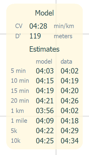
Critical Velocity
The critical velocity plot shows the best running pace I could maintain for a specific duration (the blue line), as well as the theoretical critical velocity, (the red dashed line).
The line goes up with duration because the plot shows the running pace: lower values mean slower running (4:00 min/km is faster than 5:00 min/km). There is a big drop in performance around 1h 30m mark, because this was the maximum length of interval training sessions. All the longer runs were done at an “easy” pace. There is another big drop around the 2h 45m mark, this was the longest training run I did, the remaining of the line represents my actual marathon race and the overall time for that was much slower than my training runs.

The critical velocity concept allows estimating best efforts for specific durations, even if there is no ‘best’ effort in the actual data for that duration. Together with W’Bal modeling (not described here), it can be used to design challenging interval workouts, or to determine if the interval workout was really an “all out” effort or not.