Shaded Area Plot
… in which we explore using interval renderers and color maps to create a plot where the area under the line is shaded based on data from a second data series.
The example we’ll use is the elevation profile for a short hike, where the area under the line is shaded based on the grade or slope of the track: steeper uphill sections are colored using a darker red, while steeper downhill sections are colored darker blue. This shading makes it easier to identify the difficult sections of the track, making the visualization more useful than just showing only the elevation profile. For an alternative way of presenting the same information, the elevation and grade data series could be plotted on the same plot. Here is what the final plot looks like:

Building the above plot requires putting together a few features of the Racket Plot package: color maps, interval renderers, building custom legend pictures and the new plot metrics interface for positioning the legend. We’ll start with the color maps.
Color-maps
All plot renderers have a #:color parameter which specifies the color used to draw the data. The color parameter can be either a named color, or a RGB triplet. The most common uses of the #:color parameter are for a named color or a RGB triplet:

However, the color parameter can also be an integer, and in this case, it is an index into a color map. Color maps are collections of colors which allows separating the actual colors of the plot from the renderer themselves. For example, we can write our plot using colors 0 and 1 and their meaning will be defined by the current color map:
1 2 3 |
(parameterize ([plot-pen-color-map 'tab10]) (plot (list (function sin -5 5 #:color 0) (function cos -5 5 #:color 1)))) |

The colors can be changed by specifying a different color map to plot-pen-color-map, or plot-brush-color-map. The plot package has several color maps built in (see the documentation for plot-pen-color-map) and additional color maps can be defined by the user.
The built-in color maps specify colors that are designed to look distinct from each other so data series using colors from a color map stand out on a plot. The colormaps package defines additional color maps and some of these can be used to represent various “intensities” in the data series. For example to view the cb-rdylgn–11 diverging color map, you can type (pp-color-map 'cb-rdylgn-11) in the DrRacket REPL:

In a similar way, you can use (pp-color-map 'cb-ylgnbu-9) to view the cb-ylgnbu–9 color map, which contains sequential colors:

The pp-color-map function, from the colormaps/utils package can be used to display a color map, along with the color indexes for each color, the documentation for the colormaps already displays this information, but the function can be useful when designing your own color maps.
From Grade to Color Index
To use the color maps to shade the plot based on the grade, we need a function to convert grade values into color map indexes, since colors in a color map can be selected using an integer between 0 and color-map-size, but grade values can be any real number, positive or negative.
The mapping between values from the data series and the color code is application specific. For grade values, one approach is to use a divergent color map which has a “positive” set of colors and a “negative” set of colors and map ranges of grade values to each color. Since the color maps contain a relatively small number of values, we can choose exponential ranges to cover larger grade ranges for bigger colors. Here is how it would look for the 'cd-rdbu-10 color map:

Of course, any mapping needs to take into consideration that some color map have an odd number of colors, so the “middle” range needs to be mapped from –1% to 1% for such color maps. Here is an example mapping for the 'cd-rdbu-11 color map, which contains 11 colors:

The make-grade-color-indexer function produces a function which converts a grade value into a color map index, and can do it for color maps with any number of colors — this makes it easy to experiment with different color maps, since these have a different number of colors. The function is also able to generate “inverse” mappings, controlled by the invert? parameter — this maps the grade values in reverse. The invert? feature is not strictly needed, but I wanted to use a red - blue divergent color map, but use the red values for positive grades (which are harder to climb).
1 2 3 4 5 6 7 8 9 10 11 12 13 14 15 16 |
(define (make-grade-color-indexer color-count #:invert? (invert? #f)) (define offset (exact-floor (/ color-count 2))) (lambda (grade) (define index0 (* (if invert? -1 1) (sgn grade) (exact-floor (let ([absolute-grade (abs grade)]) (if (< absolute-grade 1.0) 0 (add1 (log absolute-grade 2))))))) (define index1 (if (odd? color-count) (+ offset index0) (if (> grade 0) (+ offset index0) (+ offset -1 index0)))) (inexact->exact (min (sub1 color-count) (max 0 index1))))) |
Here is what an inverted mapping looks like for the 'cb-rdbu-11 color map:

And to use the function, we can “instantiate” it like so:
1 2 |
(define grade->color-index (make-grade-color-indexer (color-map-size 'cb-rdbu-11) #:invert? #t)) |
While it is a good idea to write some unit tests for the function, here we’ll just try it out in the REPL to check if it produces the expected results for a few cases:
> (grade->color-index 2.4)
3
> (grade->color-index -1.3)
6
> (grade->color-index 0.5)
5
> The Shaded Area Plot
The idea behind the plot is to use the lines-interval renderer to plot adjacent segments which have the same color according to our grade->color-index function. The lines interval renderer will show three elements:
-
one line (as defined by a sequence of points) at the top — the renderer allows controlling the with and color of this line
-
a second line (again, defined by a sequence of points) at the bottom — the renderer allows controlling the width and color of this line separately
-
the area between the lines is colored according to a third color which can be specified to the renderer.
The renderer will not “close” the interval, that is, it will not draw vertical lines at the start and end of the interval — this feature is useful as it will make it easy to stitch together several of these renderers and the result will be a continuous plot with different colors for the area under the plot.
Since the lines-interval renderer accepts a lot of parameters and only the sequence of points at the top and the shading color changes, we can write a small helper function, make-renderer which just accepts the arguments we need and uses our defaults for all the others. In particular, the line at the top will be green and the line at the bottom will be transparent. Also the renderer does not need two lines of equal points, so the line at the bottom is defined by just two points at the start and end of the interval:
1 2 3 4 5 6 7 8 9 10 11 |
(define (make-renderer points color) (let ([start (vector-ref (first points) 0)] [end (vector-ref (last points) 0)]) (lines-interval points (list (vector start 0) (vector end 0)) #:line1-color "darkgreen" #:line1-width 4 #:line2-style 'transparent #:color color #:alpha 0.8))) |
Before we go further, let’s load some sample data from a CSV file using the data-frame package. You can download the sample CSV file used for this plot, if you want to experiment with it. The file contains three columns, “distance”, “alt” (for altitude) and “grade”:
The plot itself is created by the make-grade-color-indexer function, which iterates over the data points in the data frame and constructs interval renderers for sequences of points which have the same color, as determined by our function which converts grade values to color indexes. This iteration can be expressed using for/fold construct:
1 2 3 4 5 6 7 8 9 10 11 12 13 14 15 16 17 18 19 20 21 22 23 24 25 26 27 28 29 30 31 |
(define (make-grade-color-renderers df) (for/fold ([renderers '()] ; renderers we've constructed so far [current-span '()] ; current list of points with the same color [current-color #f] ; current color for shaded area #:result ;; Add the last span to the renderer list (if it exists) and ;; return only the renderers (if (and current-color (> (length current-span) 0)) (cons (make-renderer current-span current-color) renderers) renderers)) ;; Iterate over the distance, altitude and grade series in the ;; data frame ([(dst alt grade) (in-data-frame df "distance" "alt" "grade")] #:when (and dst alt grade)) (define color (grade->color-index grade)) (define this-point (vector dst alt)) (if (equal? color current-color) ;; This point belongs to the same span (values renderers (cons this-point current-span) color) ;; This point is part of a new color span, make a renderer from ;; `current-span` and start a fresh span (values (if current-color (let ([span (cons this-point current-span)]) (cons (make-renderer span current-color) renderers)) renderers) (list this-point) ; start a fresh span color)))) |
To try it out, we can simply pass the result of make-grade-color-renderers to plot. The call can be parameterized with the color maps to use — one for the pen (used to draw lines and points) and one for the brush, used to draw the shaded area. Here we use the same color map for both, but they can be set to different color maps as well:
1 2 3 4 5 |
(parameterize ([plot-x-label "Distance (km)"] [plot-y-label "Elevation (m)"] [plot-pen-color-map 'cb-rdbu-11] [plot-brush-color-map 'cb-rdbu-11]) (plot (make-grade-color-renderers df))) |

The plot, as shown above, provides no indication on what the colors mean. On an interactive plot, we could add a hover callback to display the elevation and grade information about the current position, as the user moves the mouse over the plot. However, this is not an option for plots which are saved to bitmap files or added to other documents. In the next section we’ll look at how to construct a plot legend which shows what grade values correspond to each color.
Custom Legend
The plot package can display a legend entry for each individual renderer, but in our case, the plot is constructed from many such renderers (one for each segment with similar grade), so we cannot use the plot legend mechanism directly and we need to construct the legend ourselves.
The final Racket code that constructs the legend is somewhat complicated as it has several user options to control the layout, and dealing with these options obscures the simple idea behind it. Here we’ll look at how to construct the plot legend using a horizontal layout, the full legend construction function is shown at the end of the section.
We will construct the legend as a pict using the Racket pict library — the pictures produced by this library are versatile: they can be displayed directly in the DrRacket REPL, combined with other pictures, such as plot-pict, saved to bitmaps or displayed in GUI applications.
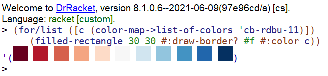
Each individual color in a color map can be obtained using ->pen-color helper function from the plot package and the color-map->list-of-colors function creates a list of all of them. From there, we can use the filled-rectangle pict constructor to make small squares of each color:
1 2 3 4 5 6 7 8 9 10 11 12 |
#lang racket (require colormaps plot plot/utils pict racket/draw) (define (color-map->list-of-colors cm) (parameterize ([plot-pen-color-map cm]) (for/list ([c (in-range (color-map-size cm))]) (match-define (list r g b) (->pen-color c)) (make-object color% r g b)))) (define color-picts (for/list ([c (color-map->list-of-colors 'cb-rdbu-11)]) (filled-rectangle 30 30 #:draw-border? #f #:color c))) |
In the DrRacket REPL, the list of squares will be displayed directly — this makes it easy to experiment with their shapes and sizes:
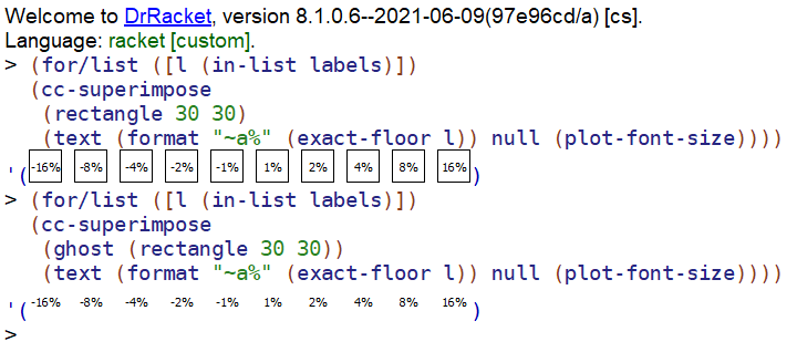
In a similar way, we can generate the labels for the legend, this time using a text pict constructor and superimposing it over a rectangle. This makes it easier to control the size of the labels — the rectangle is visible in this example, but the ghost pict constructor can be used to just reserve the space for it but not display it.
1 2 3 4 5 6 7 8 9 10 11 12 13 14 |
(define labels (let* ([label-count (sub1 (color-map-size 'cb-rdbu-11))] [half-label-count (exact-floor (/ label-count 2))] [half-labels (build-list half-label-count (lambda (n) (expt n 2)))] [negated (map (lambda (x) (- x)) (reverse half-labels))]) (if (even? label-count) (append negated half-labels) (append negated (list 0) half-labels)))) (define label-picts (for/list ([l (in-list labels)]) (cc-superimpose (rectangle 30 30) (text (format "~a%" (exact-floor l)) null (plot-font-size))))) |
Here is an example of the labels, one with the guiding rectangle displayed and another with the rectangle ghosted out:
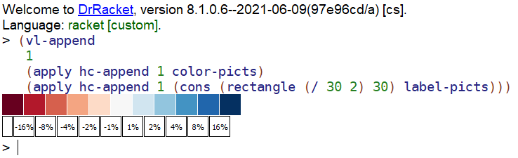
Finally, we can stitch the color and label rectangles together using hc-append and the two rows using vl-append. To position the labels between the color rectangles (since the colors represent ranges of grades), we can insert a rectangle half the width at the beginning of the list of labels:
And here is how this looks in the DrRacket REPL. In the final legend picture, all the rectangles around the labels would be ghosted out:
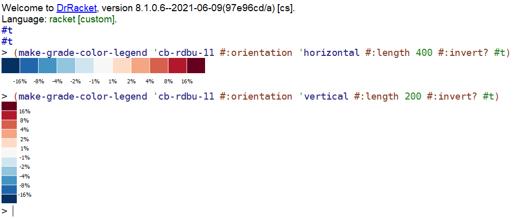
To be useful, the code that creates the legend entry needs to be more flexible: allowing both a horizontal and a vertical layout, inverting the color map entries (since we allowed for inverting them in the make-grade-color-indexer), as well as creating legend entries of different lengths or heights. All this is just simple calculations, making them somewhat boring. You can find the implementation for the make-grade-color-legend in this GitHub Gist, if you are interested. Here is how it looks:
Legend Placing
There are several ways to place the legend next to the plot, but perhaps the simplest one is to obtain the plot as a picture, using plot-pict and place the legend next to it using hc-append. This, however, does not produce a nice looking result:
1 2 3 4 5 6 7 8 9 10 |
(define result-bad-legend (parameterize ([plot-x-label "Distance (km)"] [plot-y-label "Elevation (m)"] [plot-pen-color-map 'cb-rdbu-11] [plot-brush-color-map 'cb-rdbu-11]) (define plot (plot-pict (make-grade-color-renderers df))) (define legend (make-grade-color-legend (plot-pen-color-map) #:orientation 'vertical #:length (plot-height) #:invert? #t) (hc-append 20 plot legend)))) |
This is because we used the entire height of the plot for the height of the legend, which does not align nicely with the plot area:

We could manually try a few legend heights and insert a ghost rectangle at the top, to push the legend down a bit and such a trial and error method would work of a one-off plot. The plot package however has a new feature to help with situations like these: plot metrics.
Plot metrics were added earlier this year to the plot package to allow the user to obtain information about elements in the plot and can be used to decorate the plots with additional graphics elements. Here we will use these features for a more modest task: determine the height of the plot area, so we can create a legend with this height.
The plot-pict-bounds function can be used to determine the plot area for a plot returned by plot-pict, it returns the range for the X and Y axis of the plot itself. For example, we can determine the minimum and maximum values for the two axes of our plot as follows:
The height of the plot would be ymax - ymin, or 214.818, but this value is in “plot units”, which in our case is meters, since the Y axis represents elevation. To determine the height in drawing units (that is, pixels), we will need to convert these values into device context, or DC coordinates.
The plot-pict-plot->dc function returns a function which can be used to convert points from plot coordinates to device context coordinates. The plot coordinates are what the plot-pict-bounds function returned, while the device context coordinates. It is used like so:
1 2 3 4 5 6 7 8 9 10 |
(define plot->dc (plot-pict-plot->dc plot)) (define dc-ymin (match-let ([(vector _x ymin) (plot->dc (vector xmin ymin))]) ymin)) (define dc-ymax (match-let ([(vector _x ymax) (plot->dc (vector xmax ymax))]) ymax)) (define height (abs (- dc-ymax dc-ymin))) (printf "dc-ymin ~a, dc-ymax ~a, height ~a~%" (~r dc-ymin) (~r dc-ymax) (~r height)) ==> "dc-ymin 248, dc-ymax 5, height 243" |
The calculated height, 243 in this case, is the height in pixels of the plot area. Note that the dc-ymin and dc-ymax values appear reversed, but this is actually correct, since the device coordinates grow downwards (the Y = 0 value is at the top of the picture), while the plot coordinates grow upwards (the Y = 0 value is at the bottom of the picture).
To put everything together, we need to:
- generate the plot,
- use the plot metrics interface to calculate the height of the plot area,
- generate the legend with the appropriate height
- create a small spacer pict to “push down” the legend to where the plot area starts.
- stitch the plot and legend using
ht-appendandvl-append
Below is the code to generate the final plot. Note that this version makes the spacer red, so it is visible, to better understand its purpose. In the real plot, this pict would be wrapped inside a ghost to make it invisible:
1 2 3 4 5 6 7 8 9 10 11 12 13 14 15 16 17 18 19 |
(parameterize ([plot-x-label "Distance (km)"] [plot-y-label "Elevation (m)"] [plot-pen-color-map 'cb-rdbu-11] [plot-brush-color-map 'cb-rdbu-11]) (define plot (plot-pict (make-grade-color-renderers df))) (match-define (vector (vector xmin xmax) (vector ymin ymax)) (plot-pict-bounds plot)) (define plot->dc (plot-pict-plot->dc plot)) (define dc-ymin (match-let ([(vector _x ymin) (plot->dc (vector xmin ymin))]) ymin)) (define dc-ymax (match-let ([(vector _x ymax) (plot->dc (vector xmax ymax))]) ymax)) (define height (abs (- dc-ymax dc-ymin))) (define legend (make-grade-color-legend (plot-pen-color-map) #:orientation 'vertical #:length height #:invert? #t)) (define spacer (colorize (rectangle 30 dc-ymax) "red")) (ht-append 20 plot (vl-append 0 spacer legend))) |
Final Thoughts
The Racket Pict package complements the plot package quite nicely and can be used to create additional elements for data visualization, in this case the plot legend. Also, while the plot package does not provide a function for every possible plot type, it is still possible to construct complex plots by combining existing plot features as well as additional Racket libraries.