Building a GUI Application for the Password Generator
In the previous blog post, we built a password generator and packaged it as a command line utility, in this blog post we’ll look at how to build a GUI application with the same functionality and look at some of the techniques of building GUI applications in Racket.
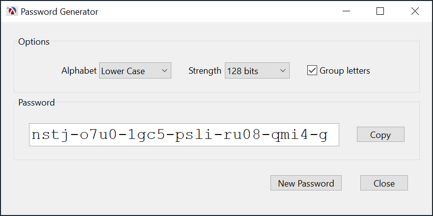
If you only need to generate passwords once in a while, you might forget the options for the password generator and the first command when using it would always be raco pwgen --help to remind you of the options. If this is the case, a GUI application might be a better option since it can present the user choices directly, and, more importantly, it can remember its settings automatically. For example, if you prefer to always generate lower case passwords with 128 bit strength and grouping the letters, the password application can remember the settings and always start up with the last selection:
The process of generating the passwords was explained in the previous blog post and will not be repeated here. You may wish to have a look at that post to understand the password generation mechanism and options, as this blog post will only discuss the GUI aspects of the application.
Building a GUI in the REPL
You can build GUI applications interactively from DrRacket by starting with an empty #lang racket/gui file, evaluating it to change the REPL language to racket/gui, than start typing your application in the REPL. For example, we can create the application window using:
The window is now created and ready, but not yet visible, we can show it by sending it the show message:
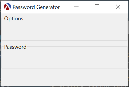
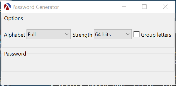
We can now add the settings, password and bottom panels, and notice how the window contents is updated:
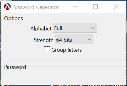
This can be followed by adding the “Alphabet” and “Strength” choices and the “Group Letters” check-box:
1 2 3 4 5 |
(define alphabet (new choice% [parent settings-panel] [label "Alphabet "] [choices '("Full" "Normal" "Lower Case" "Simplified")])) (define bit-count (new choice% [parent settings-panel] [label "Strength "] [choices '("64 bits" "96 bits" "128 bits" "256 bits" "512 bits" "1024 bits")])) (define group (new check-box% [parent settings-panel] [label "Group letters"])) |
At this point, we might not like the vertical arrangement for these controls, so we can instruct the settings panel to change its layout to horizontal mode:
We can continue adding the other controls than hook up the functionality to build the application step-by-step. This is an interactive process which you can see below, and if you haven’t written a GUI application in Racket before, it might be useful to try it out. Of course, this way of writing the application does not scale well beyond trivial programs, not to mention you have to type the entire application every time you start DrRacket. It is be more productive to start writing the application code in a file, but it is worth keeping in mind that you can write some GUI code, evaluate it in DrRacket, than start experimenting inside the REPL — this is the same interactive program development that one can use for non-GUI programs.
Racket GUI Basics
In the previous section, we used some Racket classes which correspond to GUI elements: frame%, group-box-panel%, horizontal-pane%, choice% and check-box%, and it is not too difficult to figure out what is going on just by reading the code, but if you are new to the GUI library, it might be worth clarifying a few things.
There’s a Racket class for each GUI element and these classes can be grouped in three categories:
- toplevel windows represent windows that the operating system manages. A GUI application needs at least one such window and all other GUI elements are contained in such an object. In our application we will use a
frame%for the toplevel window, but there is also adialog%class for creating dialog boxes. - containers are GUI elements which group other GUI elements in certain arrangements. Most containers are not visible directly, but the
group-box-panel%used in the example above is an exception, it displays a label and a frame around the GUI elements it contains. Examples of containers arehorizontal-pane%andvertical-pane%, which define their own layout. For custom layout, the developer will need to define their own containers, by extendingpanel%orpane%. The toplevel windows, such asframe%, are also containers and multiple GUI elements can be added to them directly. - controls are GUI elements which present information to the user or allow used input:
text-field%,choice%andbutton%are examples of such gui elements.
GUI elements in Racket form a parent-child hierarchy with the toplevel window being at the top. This is reflected in the parent init field that must be specified for every GUI control as it is created. This hierarchy helps control the layout of the controls in the window. Here is the GUI control hierarchy for the Password Generator application:

Layout control for the controls in a window is achieved through the use of container objects, for example, the toplevel frame% object will place all its children vertically, top to bottom, these children being the settings-panel, password-panel and the bottom-pane, these in turn place their own children horizontally one after the other. Each of the containers will place their child elements such that they fill out the available space available to the container itself. The layout mechanism does not allow precise control over the layout, unless one writes their own container objects, that its the developer cannot specify the exact location of a GUI element. This mechanism is simple to use and produces good results for most of the cases. Containers can be nested to an arbitrary depth and the following init arguments are available to allow further control over the layout:
min-width,min-heightare init arguments passed to GUI controls and containers to specify a minimum width and height, if not specified, the control will compute its minimum dimensions based on its contents.stretchable-widthandstretchable-heightare init arguments supported by GUI controls and containers which are used to indicate if the GUI control can stretch in the respective direction when more space is available.borderis an init argument for containers, and specifies the number of pixels to leave as as margin around its children GUI elementsspacingis an init argument for containers which specifies the minimum space to leave between children GUI elementsalignmentis an init argument for containers, used to specify how to align children elements which cannot be stretched.
User input from the application is achieved through callbacks: each GUI control has a callback init argument which is invoked when the user interacts with the control. The exact time when a callback is invoked depends on the type of control: a button’s callback is invoked when the button is pressed, a text fields callback is invoked when the user edits the contents of the field. When callbacks are invoked, regardless of the type of control, they always get passed two arguments: the control that generated the event and the actual event that triggered it. Most of the time, these arguments will not be used by the callback, but they are occasionally useful: for example, the callback for a choice% control can use its arguments to determine which element was actually selected, since this information is not passed to the callback. We will see an example of this usage later in this blog post.
The GUI controls are designed such that new classes can be derived from them to allow the developer to implement custom behavior for the application. Unfortunately, after spending some time developing GUI applications in Racket, I came to the conclusion that this is required for pretty much every time one tries to develop a useful application in Racket. Even the simple password generator application will make use of this feature, so it is best to be aware of it. The Racket GUI documentation explains which methods can be overridden for every GUI control to customize its behavior.
Building the application
To build the actual application, we need to place the experimental code in a Racket source file, so it can be saved and reused. The first things we define are the top-level window and the containers which will hold the GUI controls, they will allow us to control the layout of the GUI controls: the frame% object will place its child items, the settings-panel, password-panel and bottom-pane, one below the other, in the order in which they are created, making creation order important even though there is no direct dependencies between the child panels. The frame is created with a default width and height, but these are minimum values only, and the size of the frame will be calculated such that all items added to it will fit.
1 2 3 4 5 6 7 8 9 10 11 12 13 14 15 16 17 18 19 20 21 22 23 24 25 26 27 |
;; Implementation defined later (define (on-toplevel-close window) (void)) (define toplevel (new (class frame% (init) (super-new) (define/augment (on-close) (on-toplevel-close this))) [label "Password Generator"] [width 600] [height 275] [border 15])) (define settings-panel (new group-box-panel% [parent toplevel] [label "Options"] [border 15] [spacing 20] [alignment '(center center)] [stretchable-height #f])) ;; a group-box-panel% has vertical orientation by default, change to horizontal (send settings-panel set-orientation #t) (define password-panel (new group-box-panel% [parent toplevel] [label "Password"] [border 15] [spacing 20] [stretchable-height #f])) (send password-panel set-orientation #t) (define bottom-pane (new horizontal-pane% [parent toplevel] [border 15] [spacing 20])) (send toplevel show #t) |
In the code above, we did not create a frame% object directly, instead an object derived from frame% is used: this overrides the on-close method to call an on-toplevel-close function, which is a function invoked when the application will close.
GUI controls in the settings-panel
Next, we need to create the GUI controls which display information and interact with the user. The alphabet selection for the password is done using a choice% control, which will display a selection and a drop down menu allowing the user to select between several possibilities. The control has a choices init argument, which specifies the list of strings to display to the user and allows determining the current selection using the get-selection method, which returns a number. This interface is prone to subtle bugs, since it is difficult to keep the contents of the choice% control in sync with the data that the application needs to use. To avoid such problems, we define a “data mapping” of names to the actual data: the password-alphabets list maps an alphabet name to an actual alphabet, which were defined in the previous blog post. The choices init argument is initialized by extracting the names from password-alphabets, and each time we want to retrieve the actual alphabet, we can use the index returned by get-selection:
1 2 3 4 5 6 7 8 9 10 11 12 13 14 |
;; Implementation defined later (define (on-alphabet-choice control event) (void)) (define password-alphabets (list (list "Full" full-alphabet) (list "Normal" normal-alphabet) (list "Lower Case" lower-case-alphabet) (list "Simplified" simplified-alphabet))) (define alphabet (new choice% [parent settings-panel] [label "Alphabet "] [choices (map first password-alphabets)] [callback on-alphabet-choice])) |
The choice of password strength, the bit count for the random number, is defined in a similar way. Here we restrict selection to a predefined number of bits to keep things simple — we could have used a text field to allow the user to enter an arbitrary value, but this would have increased complexity, as we would have to validate the input.
1 2 3 4 5 6 7 8 9 10 11 |
;; Implementation defined later (define (on-bit-count-choice control event) (void)) (define password-bits '(("64 bits" 64) ("96 bits" 96) ("128 bits" 128) ("256 bits" 256) ("512 bits" 512) ("1024 bits" 1024))) (define bit-count (new choice% [parent settings-panel] [label "Strength "] [choices (map first password-bits)] [callback on-bit-count-choice])) |
The “group letters” option is a simple check box, since the only two possible values are “on” or “off”:
GUI controls in the password-panel
The password will be shown to the user in a text-field% with a larger font. The text-field% was chosen because it allows the user to select the contents of the field to copy it to the clipboard (a message% would not have worked for this purpose), but this has the disadvantage that the user can change the password by typing into the field, but since this is his or her password, this is not a big problem:
Next to the password field, we add a button to copy the contents to the clipboard. Since this functionality does not depend on the other controls, we can implement the callback directly: when the button is clicked, the contents of the password field are retrieved and placed in the clipboard using set-clipboard-string:
GUI controls in the bottom-pane
The bottom part of the window contains two buttons: a “New Password” button can be used to generate a new password and a “Close” button to close the application. The buttons are defined just like the “Copy” button above, but there’s an additional invisible message% GUI control, its purpose is to force the bottom-pane to align the two buttons to the right: since the invisible message is defined as stretchable (stretchable-width is #t), it will take up all the available space in the panel, while the two buttons will only occupy the minimum space they need, since buttons are created as non-stretchable by default. This is an example of a layout technique that can be used and it might be useful to experiment with removing this GUI control and changing the stretchable-width for the other GUI control, to better understand how to control the layout of the GUI controls:
1 2 3 4 5 6 7 8 9 10 11 12 13 14 15 16 |
(define invisible (new message% [parent bottom-pane] [label ""] [stretchable-width #t])) ;; Implementation defined later (define (on-new-password control event) (void) (define new-password (new button% [parent bottom-pane] [label "New Password"] [callback on-new-password])) ;; Implementation defined later (define (on-close-form control event) (void)) (define close (new button% [parent bottom-pane] [label "Close"] [callback on-close-form])) |
Handling user input and generating the password
If you run the application as it is now, you’ll notice that the GUI shows up correctly, but there is no response from the application when the user selects the various options — this is because all the callback we defined are empty.
This application does only one thing: it generates a password based on the currently selected password options, and this can be implemented as a single function, refresh-password which queries the state of the alphabet, bit-count and group GUI controls and calls random-bignum and encode-bignum, which were defined in the previous blog post.
To make things more interesting, the password generation is split into two parts: when the user selects a new bit count for the password strength, a new password will be generated, but when the user just changes the alphabet or grouping, the same key is encoded according to the new selection. This is achieved by keeping the key a global value and making refresh-password reusing it by default and only generating a new key when key is #f
1 2 3 4 5 6 7 8 9 10 11 12 13 14 15 16 17 |
(define key #f) (define (refresh-password) ;; Generate a key if we don't have one (unless key (define index (send bit-count get-selection)) (define bits (second (list-ref password-bits index))) (set! key (random-bignum bits))) ;; Encode the password based on the alphabet and group settings (define a (let ((index (send alphabet get-selection))) (second (list-ref password-alphabets index)))) (define group? (send group get-value)) (define encoded-key (encode-bignum key a (if group? 4 0) #\-)) ;; Set the contents of the `password-field` to password (send password set-value encoded-key) (send password focus)) |
With this, all the callback for the alphabet, bit-count, group and new-password can be updated to just call refresh-password. The callbacks for the bit-count and new-password will also clear the key:
1 2 3 4 5 6 7 8 9 10 11 12 13 |
Saving and restoring the application state
When the GUI controls are created, they will always default to an initial state: a choice% will show its first item selected and a check-box% will be unchecked, unless a value is specified when it is created. A user might expect to see their last selection when they start the application again, this way, for example, if they always want to use the “Lower Case” alphabet, they can change it once, and the setting will be remembered when the application starts up again.
This functionality needs to be implemented in two parts: when the application is closed, the current state is saved and when the application is started the last saved state (if any) is restored. Racket provides two functions get-preference and put-preferences that can be used to store and retrieve preferences and we’ll use these.
The toplevel frame% was created to call on-toplevel-close when the user closes the window. This function will retrieve the current state from the relevant GUI controls and save this using put-preferences. The callback for the close button will also invoke on-toplevel-close. When saving the state it is tempting to save the simplest thing: in our case the index in the choice controls, but the index can change if the choices are re-ordered or elements are added or removed. This code will save the actual alphabet name or bit count value, which have better chance of surviving an application refactoring.
1 2 3 4 5 6 7 8 9 10 11 12 13 14 15 16 17 |
(define (on-toplevel-close frame) (define alphabet-name (let ((index (send alphabet get-selection))) (first (list-ref password-alphabets index)))) (define bits-name (let ([index (send bit-count get-selection)]) (first (list-ref password-bits index)))) (define group? (send group get-value)) (put-preferences '(ah-password-generator:alphabet ah-password-generator:bit-count ah-password-generator:group?) (list alphabet-name bits-name group?)) (send frame show #f)) (define (on-close-form control event) (on-toplevel-close toplevel)) |
Than, when the application starts, the settings are retrieved using get-preference and the code has multiple levels of error checking: First, if get-preference does not find a value, it returns a suitable default — this will happen when the user runs the application for the first time. Next, the index-where might not find the stored value, so the code will select the first item instead. It is always a good idea to check the values retrieved from outside the application, even if these values were saved by the application at an earlier time: the application might have been updated between the time it saved the values and reading them:
1 2 3 4 5 6 7 8 9 10 11 12 13 14 15 16 17 18 |
(let* ((previous-choice (get-preference 'ah-password-generator:alphabet (lambda () "Lower Case"))) (index (index-where password-alphabets (lambda (x) (equal? (first x) previous-choice))))) (send alphabet set-selection (or index 0))) (let* ((previous-choice (get-preference 'ah-password-generator:bit-count (lambda () "96 bits"))) (index (index-where password-bits (lambda (x) (equal? (first x) previous-choice))))) (send bit-count set-selection (or index 0))) (let ((previous-choice (get-preference 'ah-password-generator:group? (lambda () #f)))) (send group set-value previous-choice)) (refresh-password) (send toplevel show #t) |
Building a stand-alone executable
You can run this application directly from DrRacket, but this is not very practical for a user, however Racket allows building standalone executables, which is very convenient for us. Executables can be built for Linux, Windows and MacOS, and with similar command line arguments, but the example below shows how build an executable on Windows. Since this is a GUI application, it will need an icon, otherwise Racket will use the default Racket icon for it. As an example, I choose a padlock icon from IconArchive and downloaded the ICO version for Windows. To create the executable, you will need to run the “raco” command below:
raco exe --gui --embed-dlls --ico pwgen-gui.ico -o PasswordGenerator.exe pwgen-gui.rkt Normally, an executable produced this way will depend on other racket libraries and files, and we would need a “raco distribute” command to create a stand-alone distribution. However, the --embed-dlls option tells raco to put all dependent DLLs in the executable, so it can run without any other supporting files.
Source code
The entire application in available in this Github Gist and you can download the icon from here.